After releasing Image to ASCII art I immediately knew what the next app I was going to make would be: a utility to make generating app icons easier. I made a small mac app to do the limited things I was working on and put it on GitHub so others could avoid that pain point. Later on, I was working making the new app icon for MuseScore 3 and noticed some more areas the app could expand to cover. Soon I had a much larger app than I initially expected and decided to polish it up and release it on the App Store.
Growing the app over a long period of time taught me a lot about the implications of architecture decisions and the characteristics of sustainable decisions.
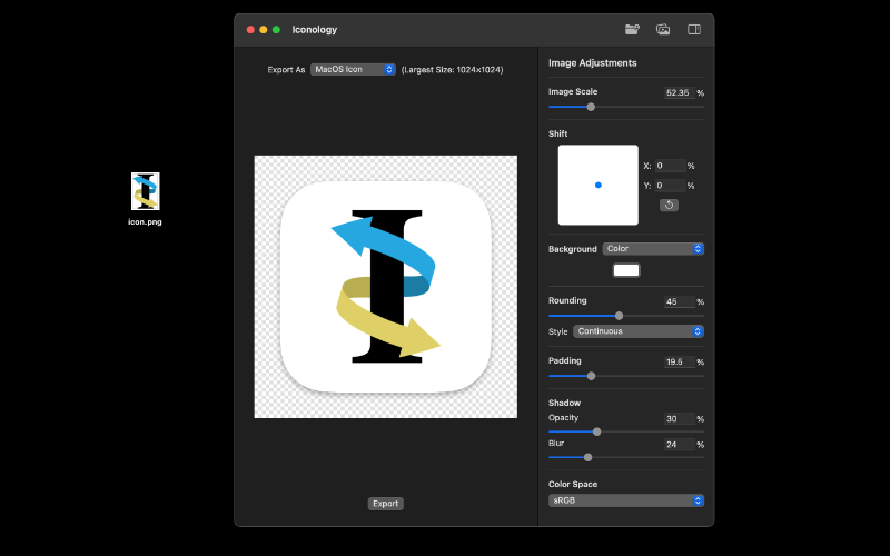
While expanding the breadth of the app, I noticed some common characteristics of app icons. Many icons contain a some symbol on top of a colored background. I figured the app would be even more useful if instead of only resizing icons, it could also help the user create the icon based off of an existing design they have for the inside. That would also allow users to easily export icons for many different platforms all of which have different requirements for aspect ratio and shape from one input image.
To accomplish that, I built an image editing feature into the app using Core Graphics. The image editor was a lot of fun to work on and I learned a lot. It always excites me when some math shows up naturally in a project, and this was one of those cases with the geometry it required.
One problem I had to overcome was that I wanted the editor to update live, however the image constantly regenerating when the user would slide a value was causing performance issue. To improve performance, I build a caching system so intermediate edits were saved and reused to reduce the amount of computation when sliding values.
During my time at WWDC19 as a scholar, I attended a macOS design consultation for Iconology. The conversation was very informative for me and directly contributed to the designs of the position selector and custom preset editor. Having a better idea on how to apply the Human Interface Guidelines also helped me on this app along with future projects.
I couple years after the initial release, I released the first major update. It brought a refreshed interface designed around the current macOS design language and improved image modification functionality. In this update, I switched the interface from AppKit to primarily SwiftUI. I made that decision because my experience using it in my Image to ASCII Art update was positive, and I wanted to learn more about it. The most notable image generation improvement was the spot-on macOS icon rounding. I detailed my journey of figuring that out here.